Why Is Blue Such a Popular Colour for Branding? – A Streaming Service Breakdown
01 Jun, 20232 minutesA couple of weeks ago, we wrote a few words regarding Multimedia Conglomerate Warner Bros. D...

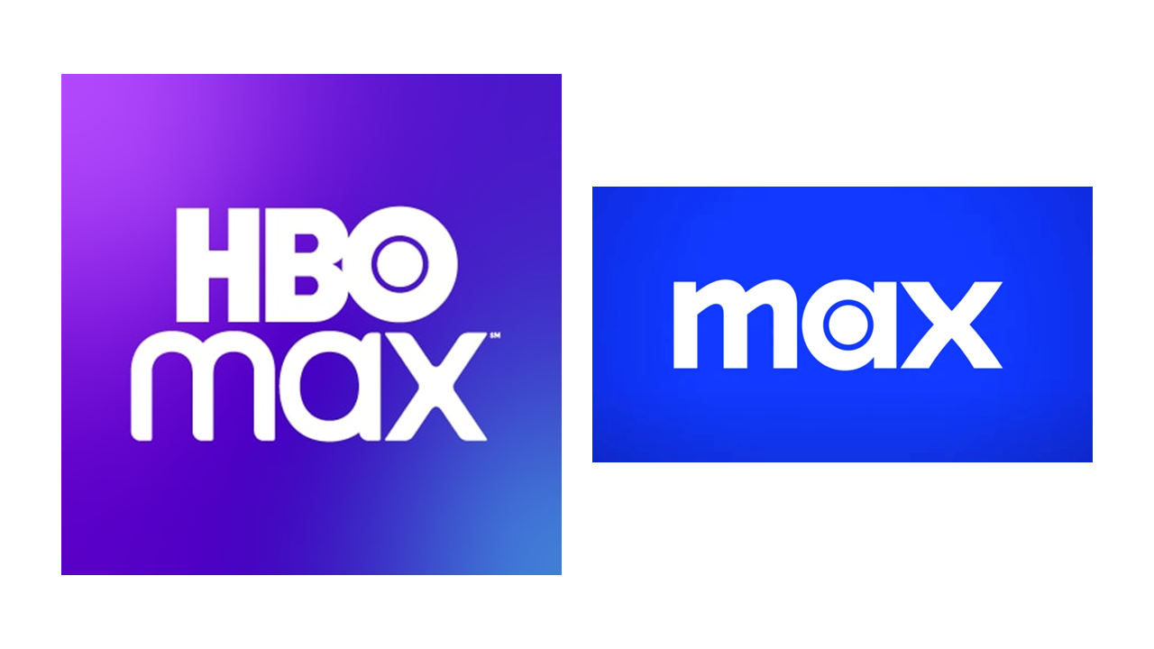
A couple of weeks ago, we wrote a few words regarding Multimedia Conglomerate Warner Bros. Discovery’s fascinating marketing decision to strip its premier streaming service of the HBO branding and go just by “Max”.
It posed interesting questions towards what the long-term impact and branding implications would be from the change and whether the marketing strategy would enable the company to finally compete with the likes of heavy-hitters Disney + & Netflix.
However, one fascinating facet of the rebrand we didn’t touch on was: Colour. Along with the full name change, Warner Bros. Discovery has moved away from the platform’s original purple colourway and replaced it completely with blue.
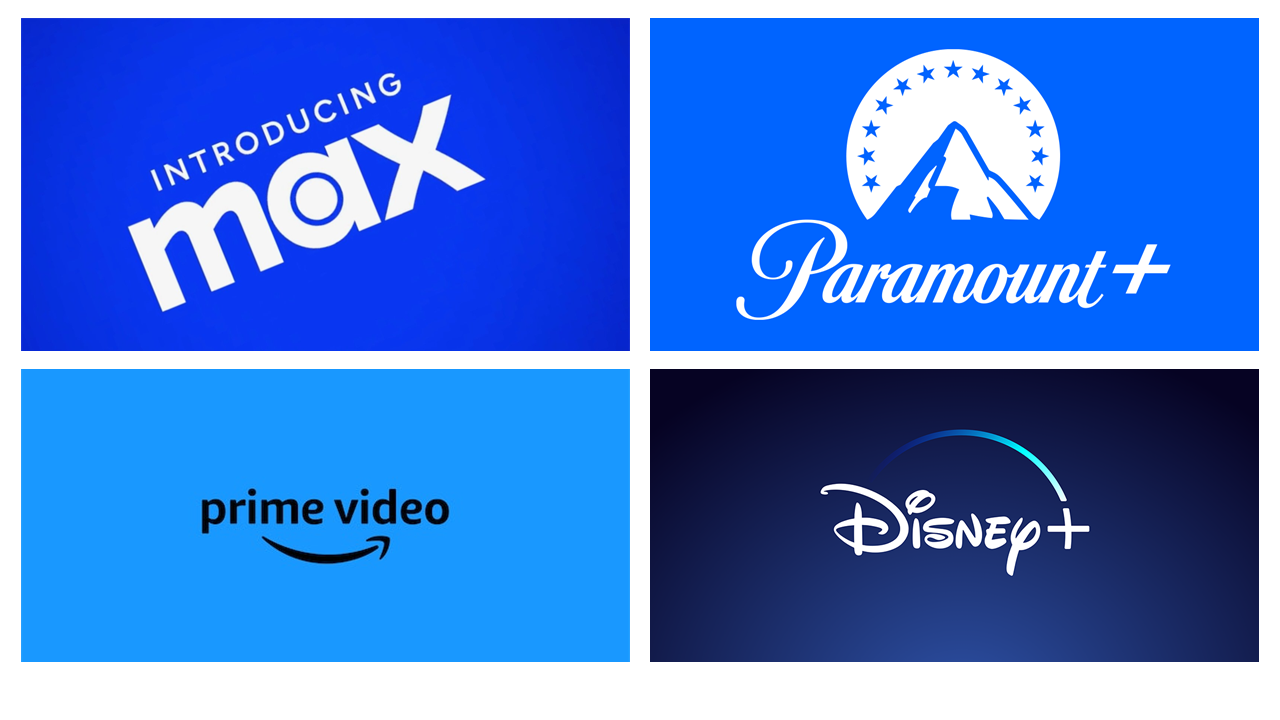
The question is, why did HBO Max choose to switch from their fairly unique purple colour? Although purple was a distinguishing feature of their platform, other streaming services such as Paramount+, Prime Video, and Disney+ have also incorporated different shades of the colour blue into their branding.
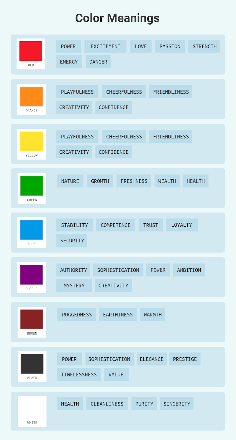
So, why? The answer is relatively simple and speaks to the power of brand association and how colour can shape identity. Warner's global CMO of streaming clarified that blue is "the most universally liked colour." He explained the change by saying: ...
“There are different types of blue, and if you put us in juxtaposition to Disney or Paramount or Prime [Video], they look different. With our blue and the way that the logo is designed, what we were going for is a combination of premium but accessible.” - Patrizio “Pato” Spagnoletto, Warner Bros. Discovery global CMO of streaming Patrizio
HBO Max's original purple colour is traditionally associated with royalty, authority, and luxury, which were fitting for the premium, highbrow, and award-winning content that the original HBO brand represented. However, with the brand aiming for MAX to be a family-friendly, everyman brand the whole family can watch, it’s no longer a colour they think is viable.
And so, they chose Blue! Although it may not have been the most distinctive decision, colour undoubtedly plays a significant role in establishing a connection between consumers and brand recognition. After all, Coca-Cola wouldn't be the same without its iconic red colour, and Barbie wouldn't be complete without pink.
It remains to be seen whether Warner Bros. Discovery’s rebranding strategy will pay off in the long run and lead to a change in the brand’s streaming services fortune. Perhaps the two-piece combo of a name change and colour switch will be viable? Either way, as Pato explains:
“Consumers will tell us if we got it right, and we think we did.”
*ENDS*