What does Apple’s magic mouse charge port represent in terms of design?
14 Apr, 20233 minutesEvery now and then when I scroll through LinkedIn, I’ll see pictures of the controversial ma...

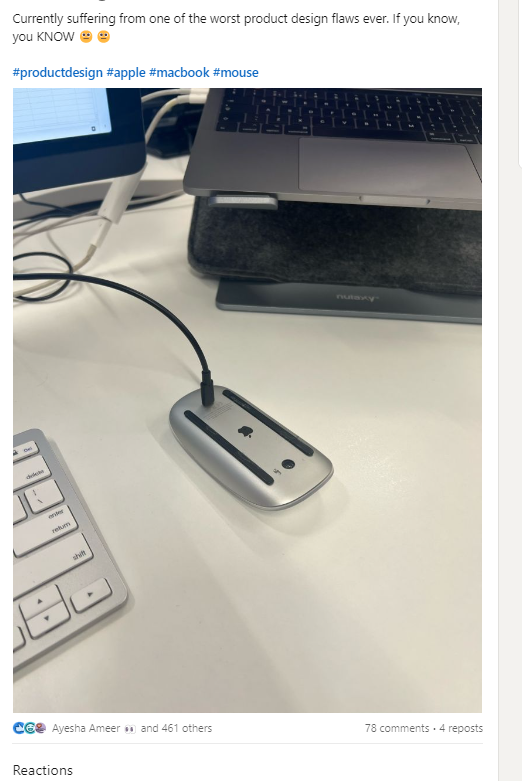
Every now and then when I scroll through LinkedIn, I’ll see pictures of the controversial magic mouse and the topic will arise again on how it is Apple’s worst designed product and an example of how to make a product counter intuitive to users.
Which makes sense, the charging port has been put at the bottom of the mouse which prevents you from using it while charging and requires the user to leave their mouse upside down until it’s finished
Why have they done this? – Most people seem to believe it’s just a poor design decision that hasn’t been thought through, but I think it’s more complex than that.
In my perspective, I believe it’s a deliberate choice aimed at discouraging usage while the device is charging.
We all know Apple's design philosophy often revolves around minimalism and sleek aesthetics. With the Magic Mouse, Apple aimed to create a seamless and clutter-free device that finds a middle ground between form and function.
What does this represent in terms of product design? And a wider question, what does it signify regarding Apple’s relationship with its users? I think it’s a combination of two things -
- Not trusting your product enough to work sufficiently (I.E the battery not lasting enough and, thus users feeling compelled to plug it in)
- Not trusting your consumer enough to use your product as you wish due to old habits (I.E traditionally we mostly use a mouse with wires)
Here’s the thing though, in design, if you trust your product and consumer to work as intended – you’ll often find they will! Case in point: MRJ Recruitment’s team member who himself uses a popular wireless mouse for most of his work.
He uses a MX Master 3 device that has the charging port positioned where he can use the mouse plugged in but doesn’t because a) it’s a wireless mouse that he has bought to use wirelessly 😂 b) the product works well enough to where charging is infrequently needed once every 3 months.
Although Apple, a company known for their stylish, slim, and trendy products, may have prioritised aesthetics over functionality, deliberately designing a product poorly to discourage negative consumer habits is, in my opinion, an example of bad design. If you design a product well enough to counter the old habits of your users – chances, are they will.
Apple is usually quite successful with this. The removal of the headphone jack whilst initially met with a negative reception, was eventually accepted because Apple designed stellar products (the AirPods) that overrode old consumer habits. It appears however, that the same lesson was not applied to the magic mouse 🤣
Either way, it should serve as a valuable lesson for every designer when embarking on the creation of a new product.